ProFound - An App for Photographers
May 31, 2019 / App Creation
ProFound - An App for Photographers
Background
Professional wedding photographers typically work as a two person team on the wedding day, but they are often solo businesses throughout the week. The main photographer is called the “Primary,” and the other photographer is the “Second.” The Primary photographer is booked by the bride and groom, while the Second photographer is contracted by the Primary photographer for the wedding day.
For busy wedding photographers, finding a second photographer can be a tedious and constant task because of constantly shifting schedules and an abundance of new photographers. On top of that, the second photographer needs to have a solid portfolio and be trustworthy at a wedding.
Defining the Problem
Current Landscape
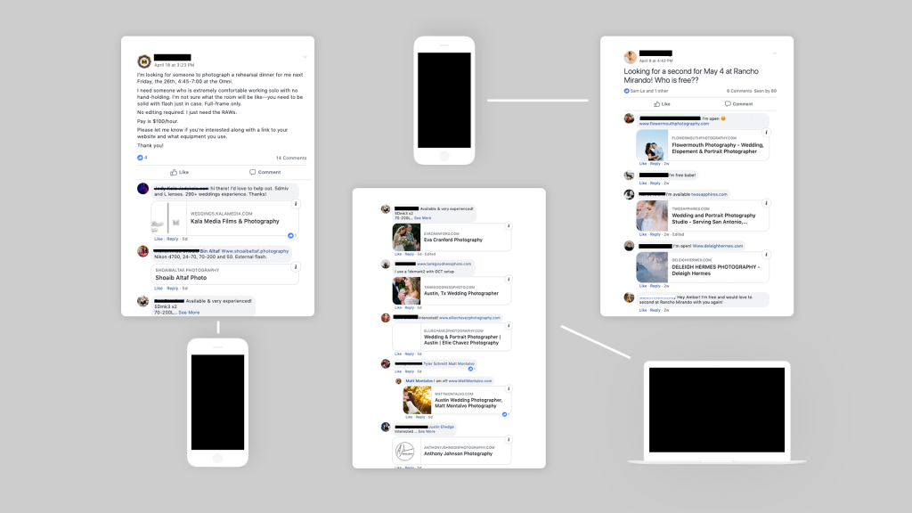
In most cases, a photographer will blitz their personal network through social media, private messages, or email to find a second photographer.
Difficult to keep track
The most popular method of finding a second photographer is posting into local Facebook photography groups. This will often yield a wide range of results, and the only way to judge the quality of the photographers is to stalk each persons profile and hope for the best. It can get chaotic and difficult to keep track of each photographer and their skill level.
It can be easy to lose track of media channels when communicating with multiple photographers simultaneously
Interviews
Despite my first-hand experience with the struggles, I needed to be sure other photographers experienced the same problem. Using some of the following questions, I interviewed photographers about their experience with hiring second photographers:
-
- You have a wedding coming up. What is your current process of finding a second photographer?
- How do you keep track of all the candidates for a job?
- You are available on a weekend and would like to second shoot for someone. How do you go about finding this work?
- How would you improve the hiring process?
In one interview, the photographer said:
“I feel like I am constantly hunting [for second photographers]”
Another photographer said:
“My approach is very informal. I’ve always wondered if there was a better way.”
Surveys
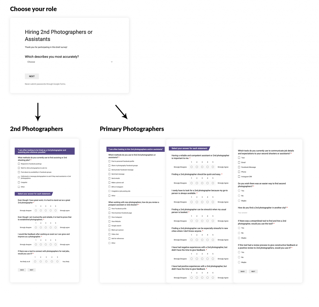
To gather a more quantitative perspective on the problem, I created a survey that I sent out to several local Facebook photography groups. In the form, I separated users by their main roles: 1) they are most often hiring other photographers or 2) they are looking to be hired.
I received 25 responses over the course of one week.
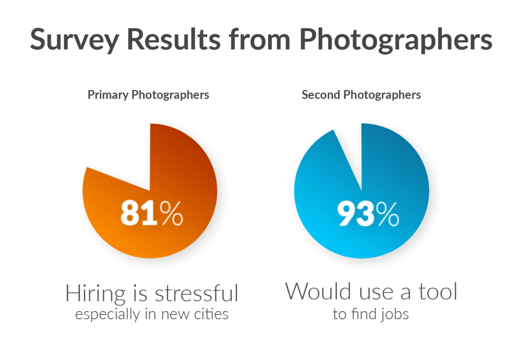
From photographers hiring other photographers (Primary Photographers), I discovered the following:
-
- 81% of photographers think that hiring a second photographer is stressful especially when they’re go-to person is not available and in new cities
- 91% of photographers might use a tool to streamline the process of hiring second photographers
- 81% of photographers wish there was an easier way to find second photographers
And for photographers looking to be hired (Second Photographers), I found the following:
-
- 93% of photographers agree or strongly agree that they would like feedback after an event so they can grow and improve
- 93% of photographers would use this tool to connect with photographers for real jobs
- 50% of photographers think that it is hard to prove trustworthiness and reliability through the current method of finding jobs (responding to Facebook posts).
Synthesis
After collecting all the data from the interviews and surveys, I found a repeating themes about the hiring and posting process:
Hiring second photographers is messy.
In other words, both photographers looking to hire and be hired find the booking process stressful, especially when traveling for work.
Based off this information from the interviews and surveys, I concluded that creating an app to streamline the process of connecting photographers with other photographers for work was worth pursuing.
Research
Back to top – Previous Section – Next Section
Personas
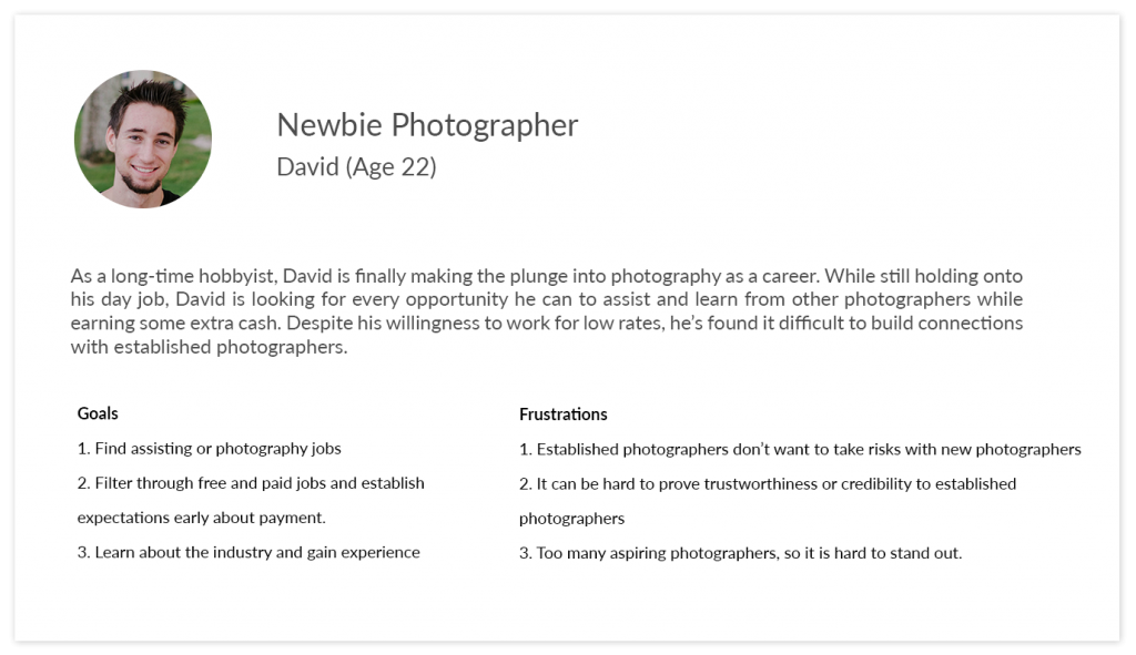
To guide my thinking and build empathy for my users, I researched two personas that describe my target users: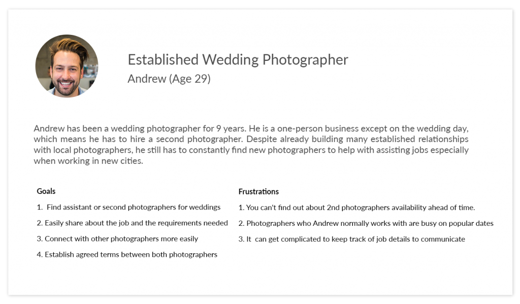
Job Stories
Using the Jobs to the Done framework, I created two job stories to narrow down the main goals:
User #1 (Primary Photographer)
When I have a wedding coming up
I want to hire a second photographer
So that I can have help on the wedding day
User #2 (Second Photographer)
When I am not booked on a weekend
I want to find jobs as a second photographer
So that I can increase my income and gain experience
Ideation
Back to top – Previous Section – Next Section
Current User Flows
The existing user flow for Looking for a second photographer:
The existing user flow for Looking for jobs as a second photographer:
Revised User Flow
The revised user flow for Looking for a second photographer
The revised user flow for Looking for jobs as a second photographer:
By analyzing the current user flow, I streamlined the process by shortening the process of looking for a photographer from 6 steps down to 4 steps. I also shortened the flow of looking for jobs as a second photographer from 5 steps to 3 steps.
Design
Back to top – Previous Section – Next Section
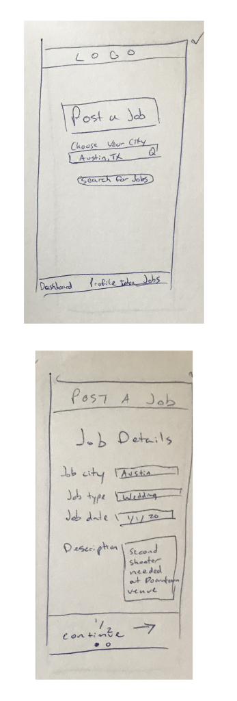
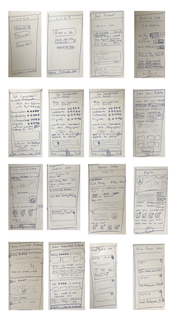
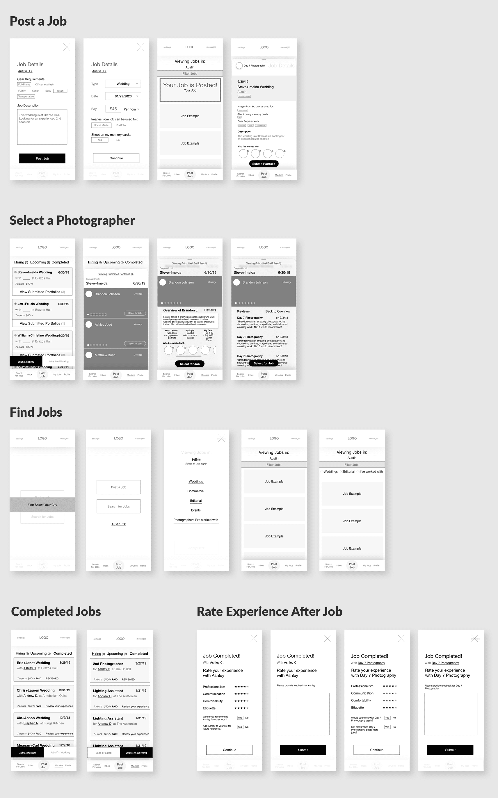
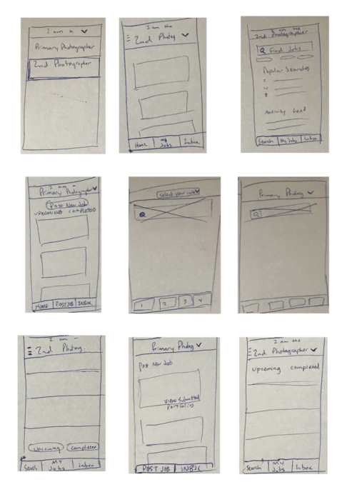
Based off the revised user flows, I quickly sketched wireframes for the app.
Sketches
Low-fi Wireframes
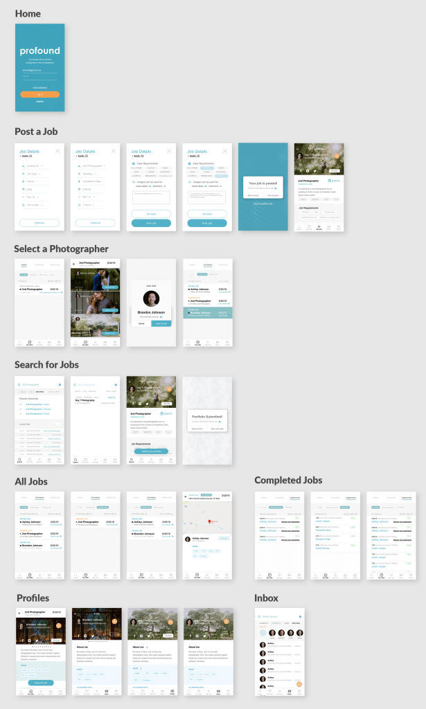
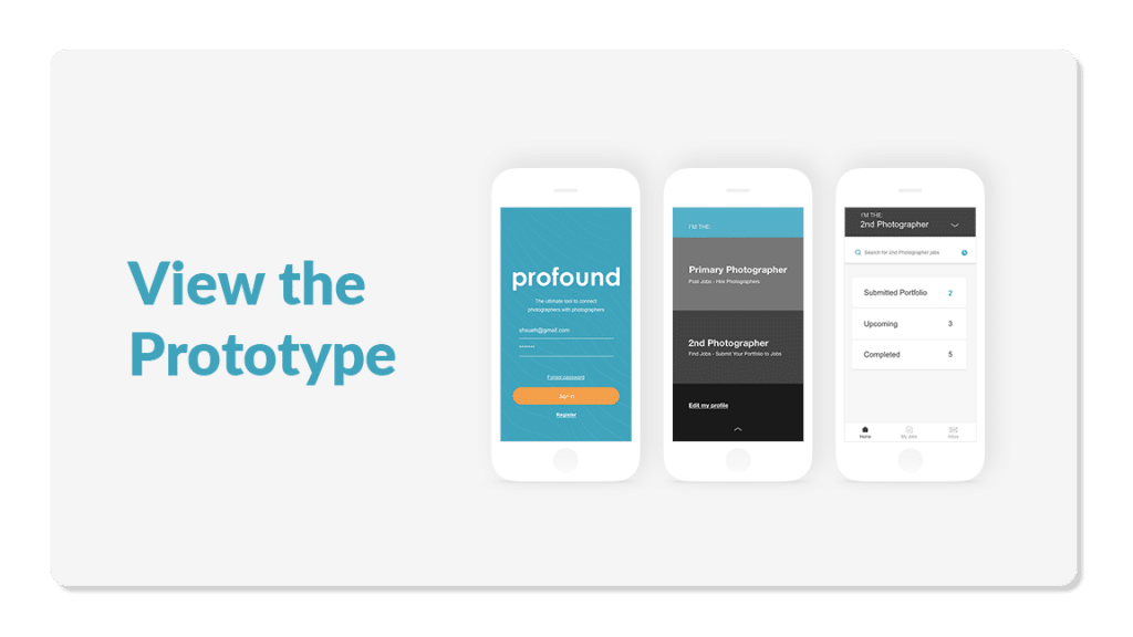
High-fi Prototypes
User testing
Over the course of 2 weeks, I tested 5 users on the usability of the app by giving 5 different tasks and recording their experience:
-
-
- Post a job
- View photographers who submitted their info to your job
- Select second photographer for the job you posted
- View jobs you are working
- Find jobs as a second photographer and submit your portfolio
-
5 out of 5 users were able to complete the tasks all the tasks.
Feedback
Back to top – Previous Section – Next Section
Rating features
One user mentioned that the star rating feature (seen in the low-fi wireframes) made the experience feel too transactional and Yelp-like. This could prevent users from wanting to use the platform altogether, so I removed the star rating features shortly after early rounds of testing. From the initial surveys, I learned that feedback after an event was a highly desired feature, so I kept the “review experience” links for completed jobs.
Getting Lost
While users were successful in using the app to complete tasks, I heard several comments about users getting lost in the app. Since several screens looked alike, users would forget which section of the app they were in. As they described their thought process out loud, I heard users think through their decisions like this,
“Upcoming jobs, jobs hiring, and posting a job….hm, let me think about that.”
One user mentioned that they would search for jobs, but then get confused since the search screens looked like the jobs screen. In short, they couldn’t tell if they were viewing jobs they were working or jobs they were hiring for.
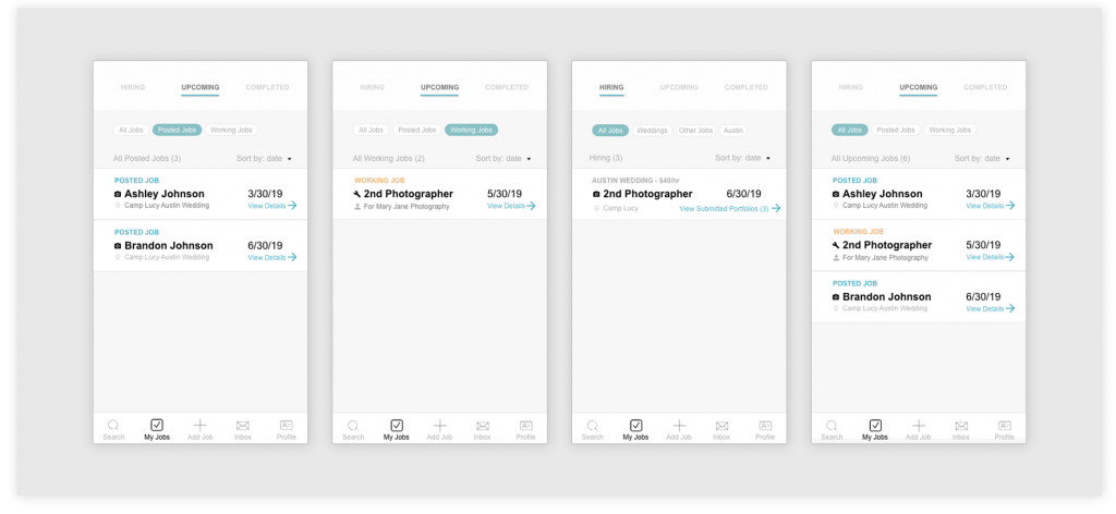
By listening to users think out loud, I discovered that I needed to differentiate the designs of my job listing screen, search screen, and hiring screen.
Reiteration
Back to top – Previous Section
Separating the Users
Since my two users are Primary photographers and Second photographers, I realized I could remove sections of the app based on the role of the user as a way to prevent users from getting lost. This in return would reduce distractions while elevating the most important task for each role:
Primary photographer = Post jobs
Second photographer = Find jobs
To clarify my thoughts on this flow, I created a flow chart with this revised user flow:
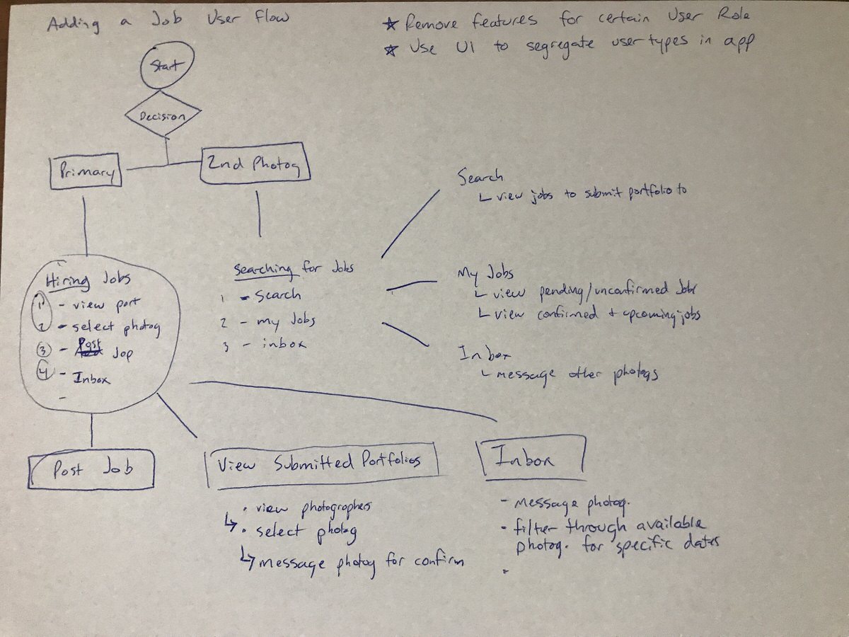
At the end of this brainstorming session, I concluded to:
1) remove features for certain user roles
2) change the UI to segregate users (Primary photographers and Second photographers) within the app.
Improvements
Researching Existing Design Solutions: Buyer and Seller Model
Based on this pivot, I researched apps that are serving 2 different types of users in one single UI. Airbnb, Uber/Lyft, Ebay, and Indeed all follow this model, and I was able to find inspiration to bring into my UI.
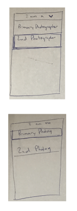
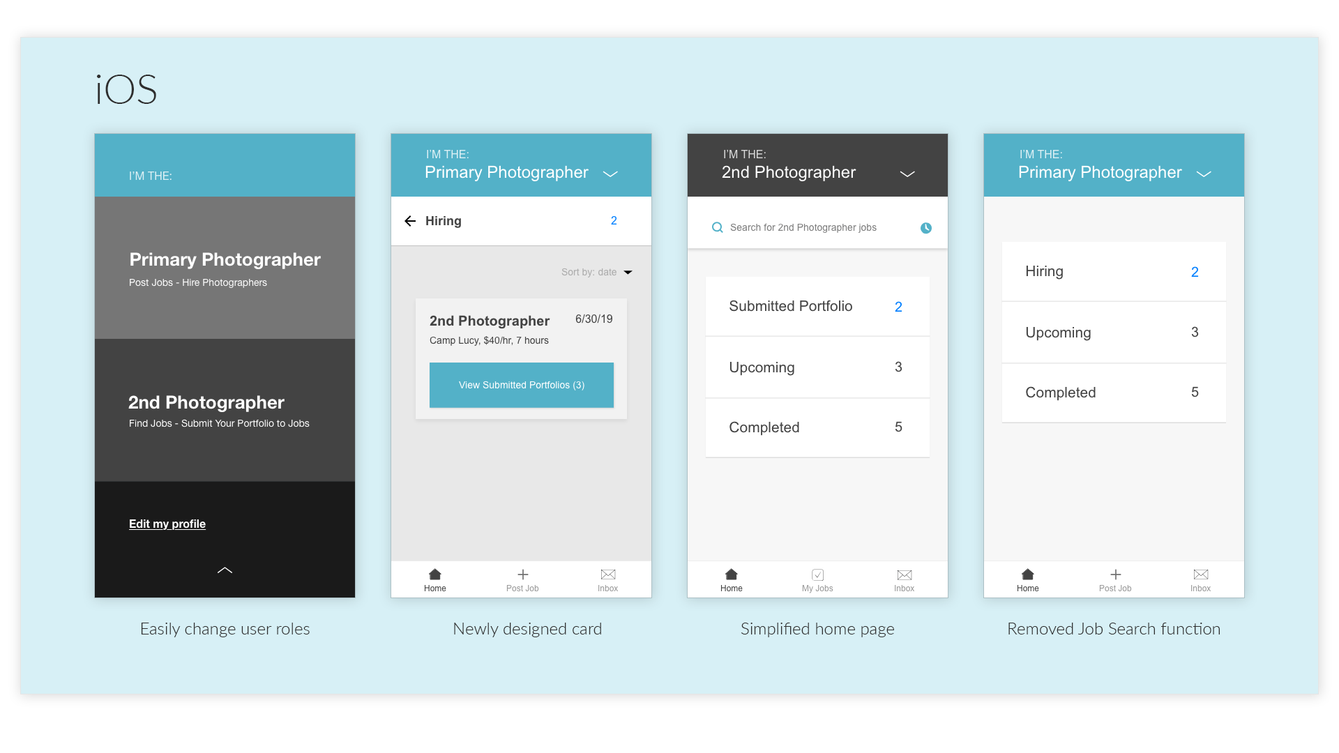
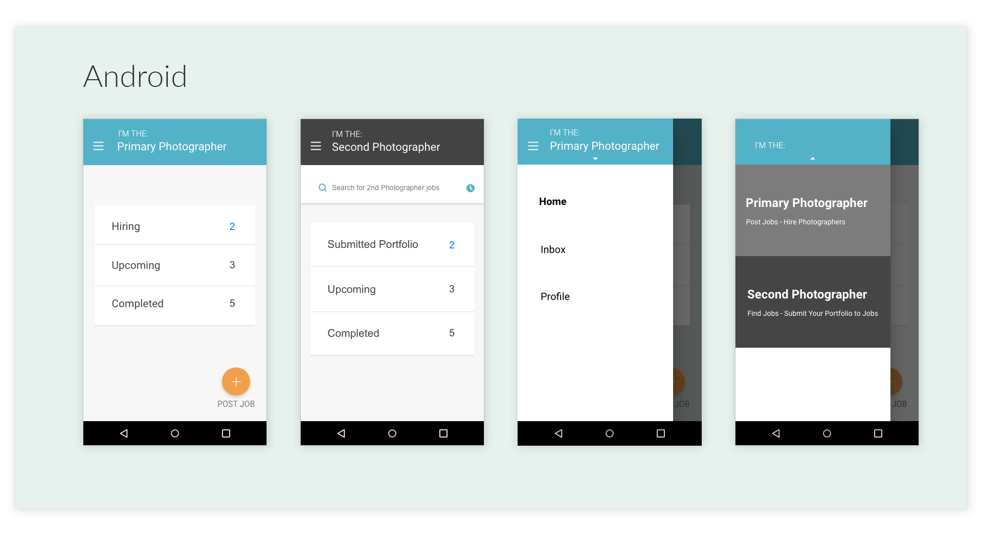
I knew I needed to allow the user to change roles easily, and they also needed to clearly know which role they were at any point in the app.
Updated wireframes
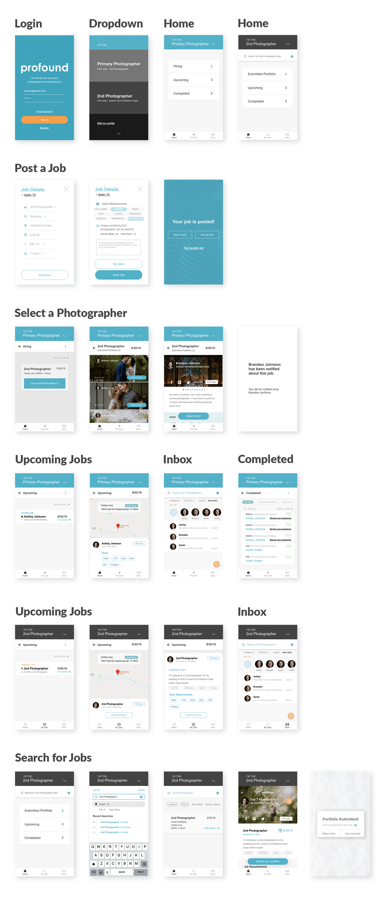
New screens
Newly designed screens with differentiated designs and clearer interface
Compared to before:
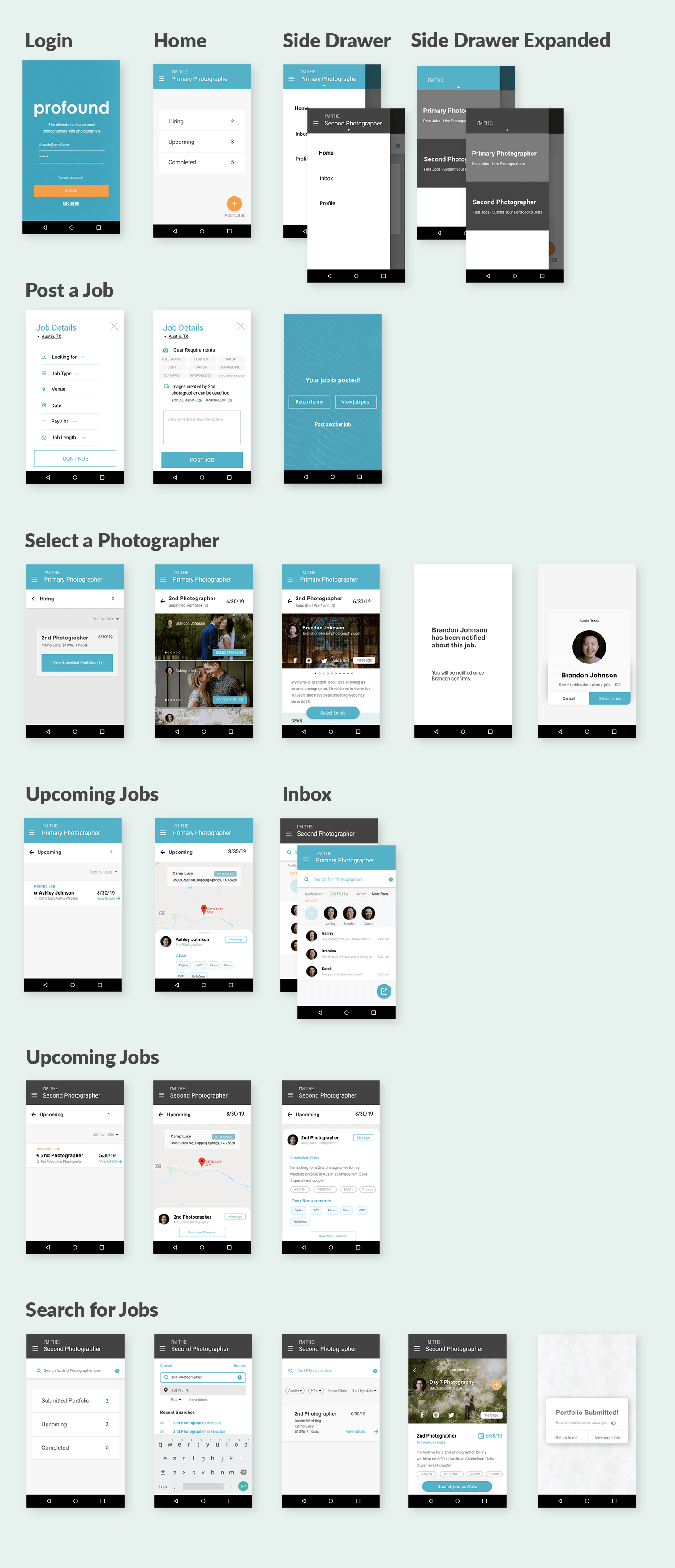
More updated screens
iOS
Android
Validation
To test the effectiveness of this redesign, I returned to the same users for additional testing.
One user who thought out-loud while navigating the app said:
“This is exactly what I’ve been looking for to stay organized.”
Another user said, “This app would help me stay organized instead of forgetting what I have communicated to my Second photographers. It’s great for both categories [primary and second photographers]”
When watching users use the app again, it was night and day.
Faster completions
Users completed tasks in half the amount of time and tapped buttons almost instantly when they saw them.
Intuitive flow
With the revised flow, there were less options to read through, and the prime role of the user was unmistakable for each screen. This led to less second guessing when navigating the app.
Simple to navigate
All 5 users claimed that the new design made the app much more simple and easy to navigate.
This reiteration was successful and users were pleased with the overall experience.
Conclusion
Through surveys, interviews, personas and job stories, I discovered the core issue with hiring second photographers: it was a messy process. Using my user research, I designed a simple, elegant, and robust solution to streamline the process of hiring second photographers and posting jobs. The process of user-testing and reiteration proved worthwhile as the product was greatly improved.
Limitations
-
- First-hand experience – since I am the target user for this app, I already have first-hand experience into the problems of a wedding photographer. In the case that I did not know the problems right at the start, I would dedicate a larger portion of time to interviewing ideal users and asking questions about their problems.
- Supply and Demand – In order for an app like this be successful, it would require active users from both the job posters and the job seekers. This would require tailored marketing strategies with specific messaging to each user, the Primary photographer and the Second photographer.
