uShip On-boarding Redesign
uShip On-boarding Redesign
Background
uShip is an online marketplace that connects shippers with carriers, primarily for large items like cars and furniture.
uShip began a migration to Okta for user account management in January 2020. With over 8 million users, this was no small task. Part of this user account migration involved re-designing the registration process for 1) increased account security, 2) more robust user on-boarding, and 3) streamlined account verification for payments.
Research
To dig into the problems, I interviewed 4 employees at uShip who work directly with our users. I learned that the main problems around registration center around the carrier on-boarding experience.
One customer support team lead said, “We’re not capturing the relevant info at registration.”
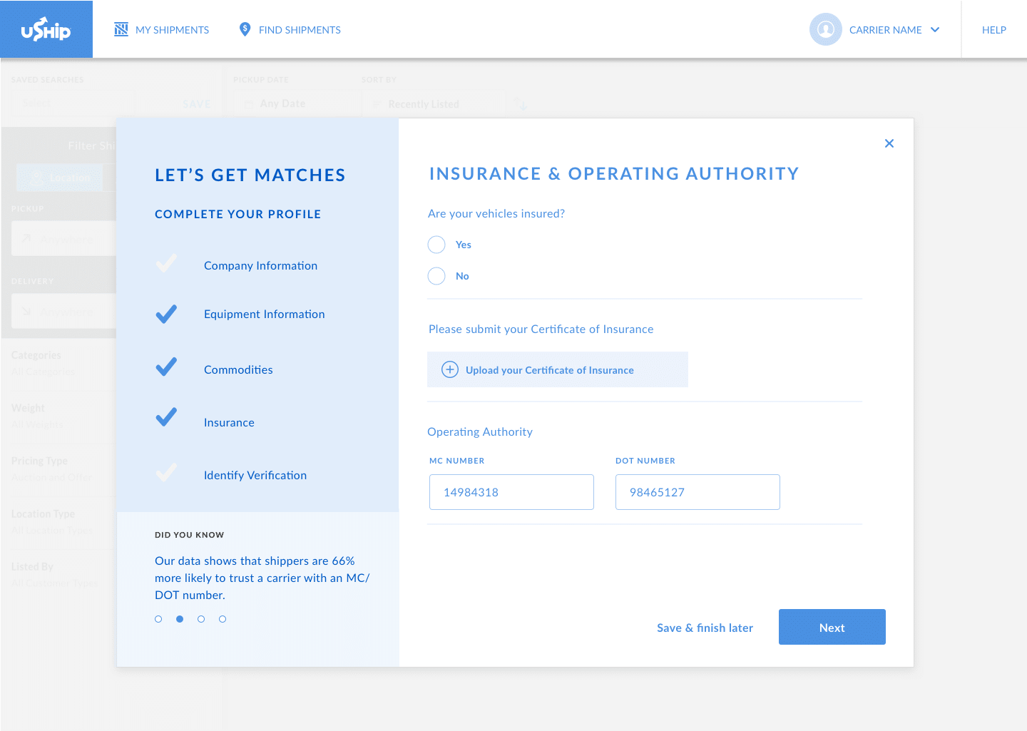
Our Trust & Safety team lead said, “Insurance is the #1 indicator of how serious their business is,”
Another employee said, “On-boarding should be moved to smarter areas” and
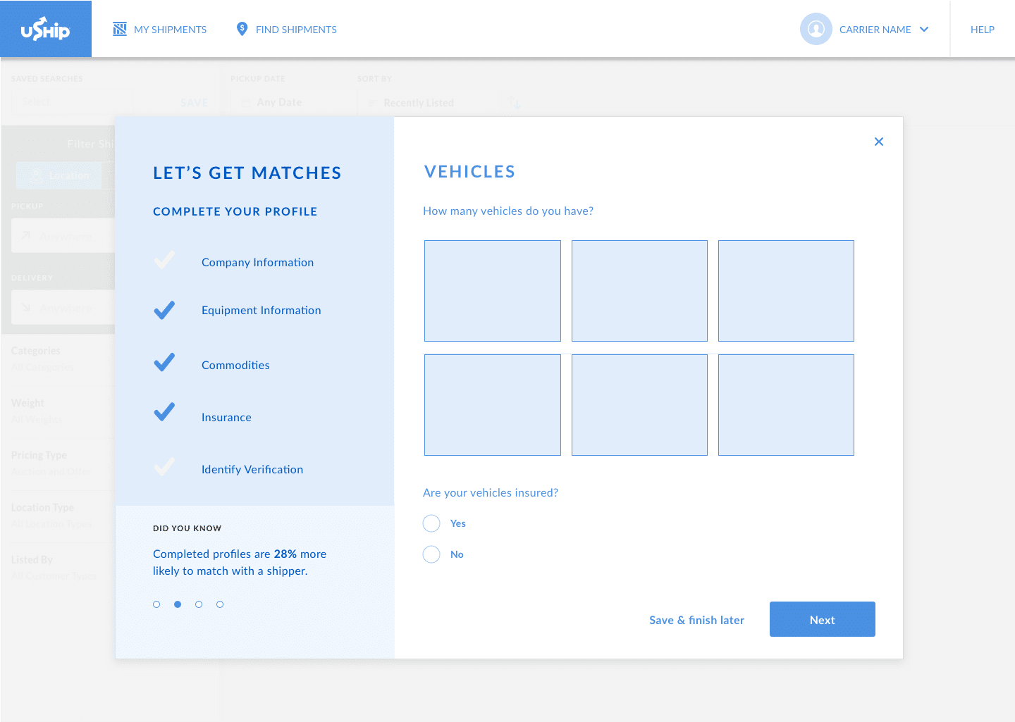
“We should be asking more about their trucks and equipment.”
Problem Statements
All of this pointed to the problems around registration for carriers. In summary:
We were not collecting the right information at registration, and on-boarding is non-existent for carriers.
Goals
Registration needed a makeover, and a clear goal would be the first step:
Collect more relevant information at on-boarding to improve the product experience for shippers and carriers.
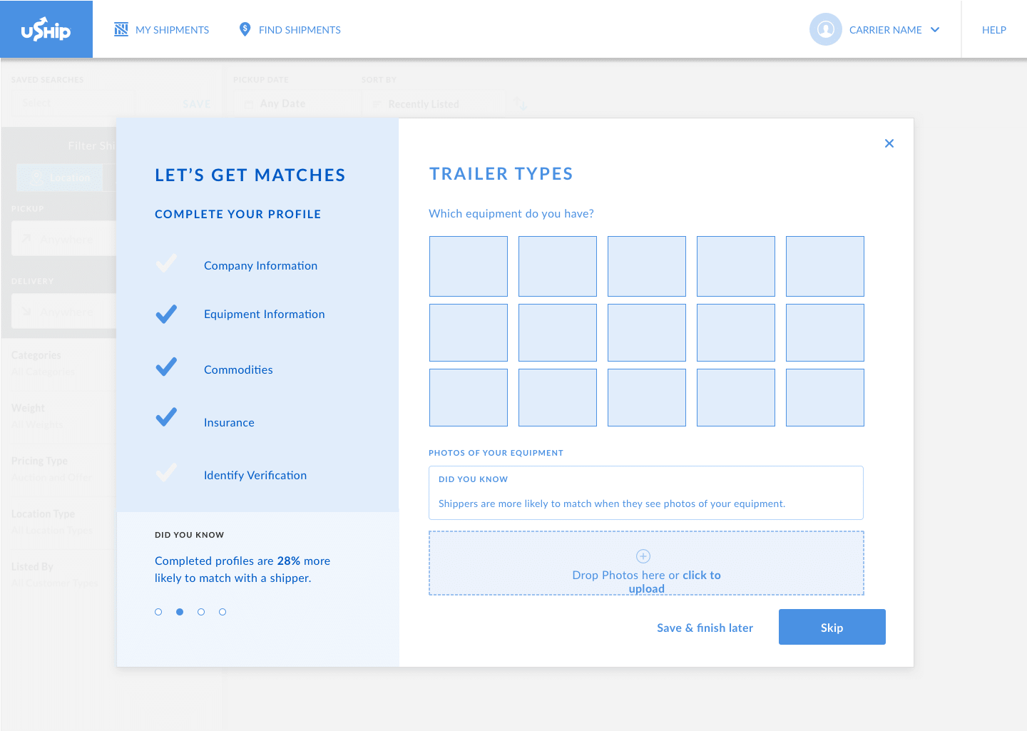
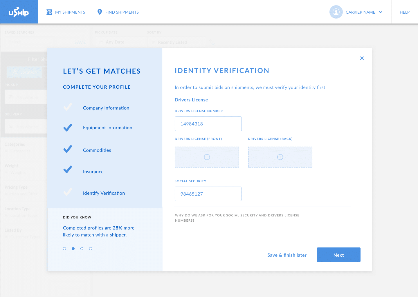
When digging into what specific information to collect, I learned that company info, vehicle info, trailer types, commodities, certificates/insurance, and identity verification were the most important.
Ideation
I created a flow chart to visualize this new direction with a shortened registration process, a skippable on-boarding, and an incremental on-boarding process throughout the user experience. I presented my design strategy and vision with two product managers working on this migration.
After alignment with this design strategy, I moved on to create wireframes.
Wireframes
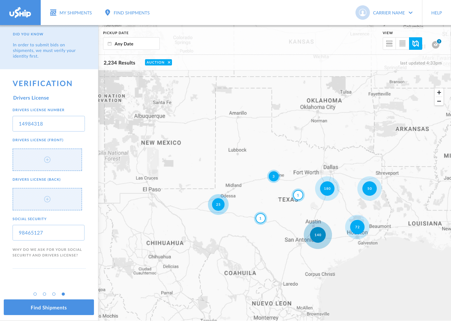
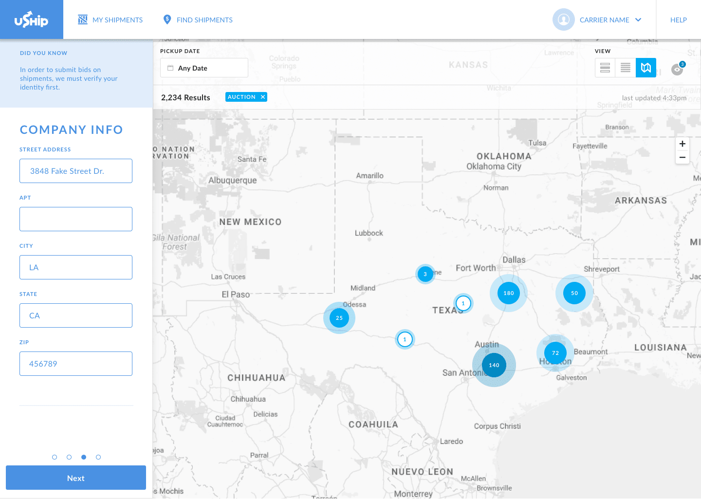
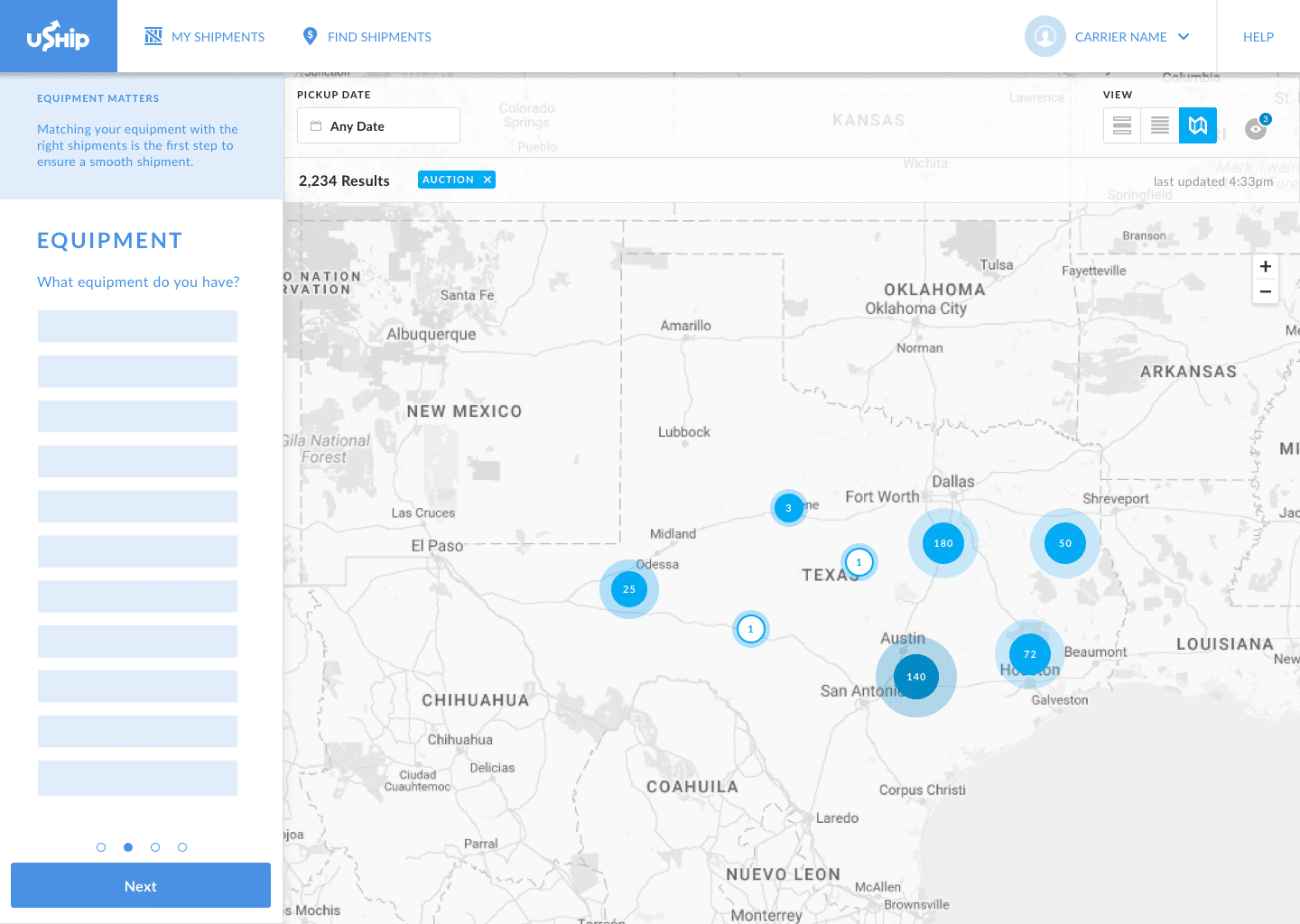
1. User registers in one step
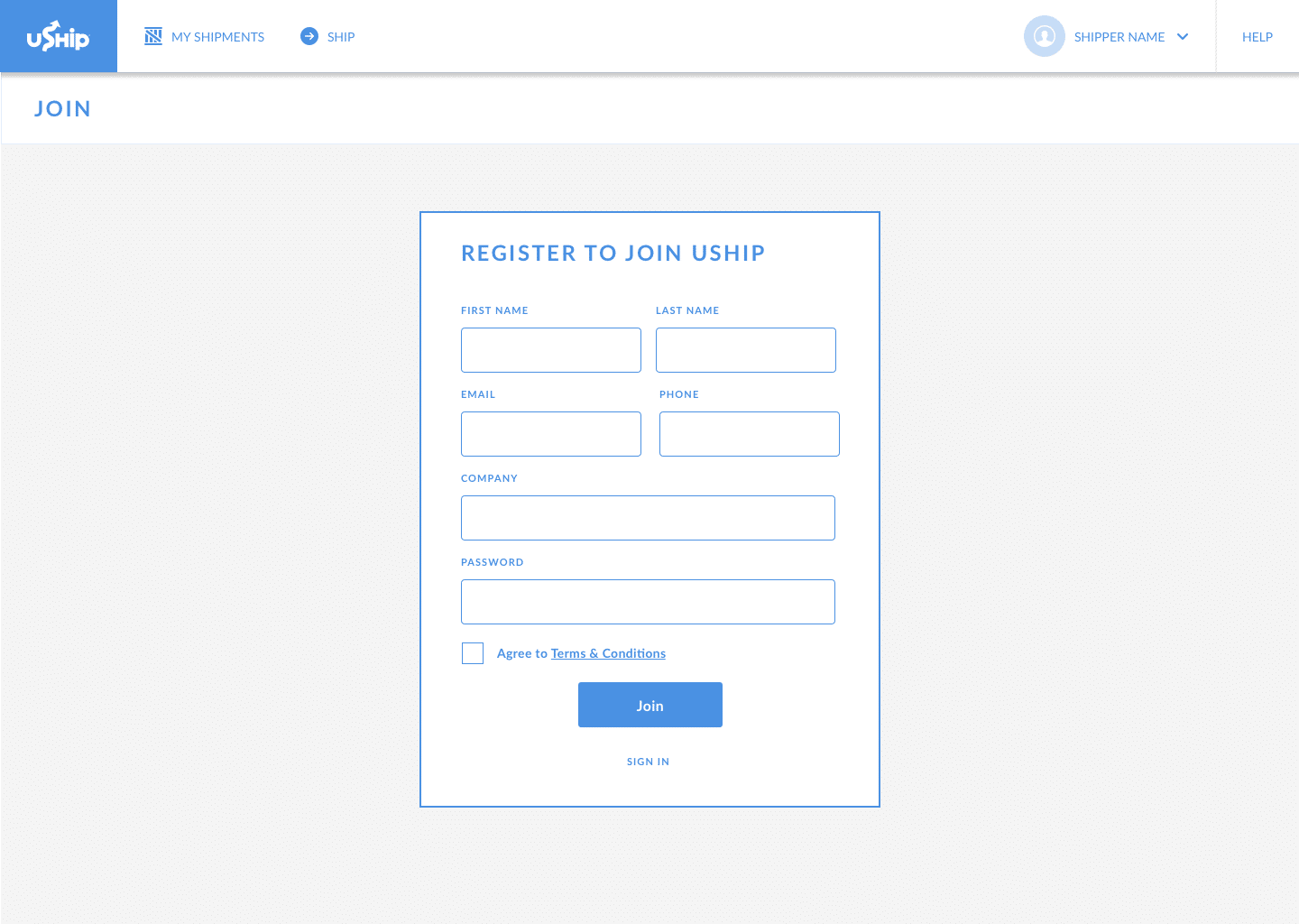
2. After registration, the user enters the on-boarding process
3. Additional steps for on-boarding can be skipped.
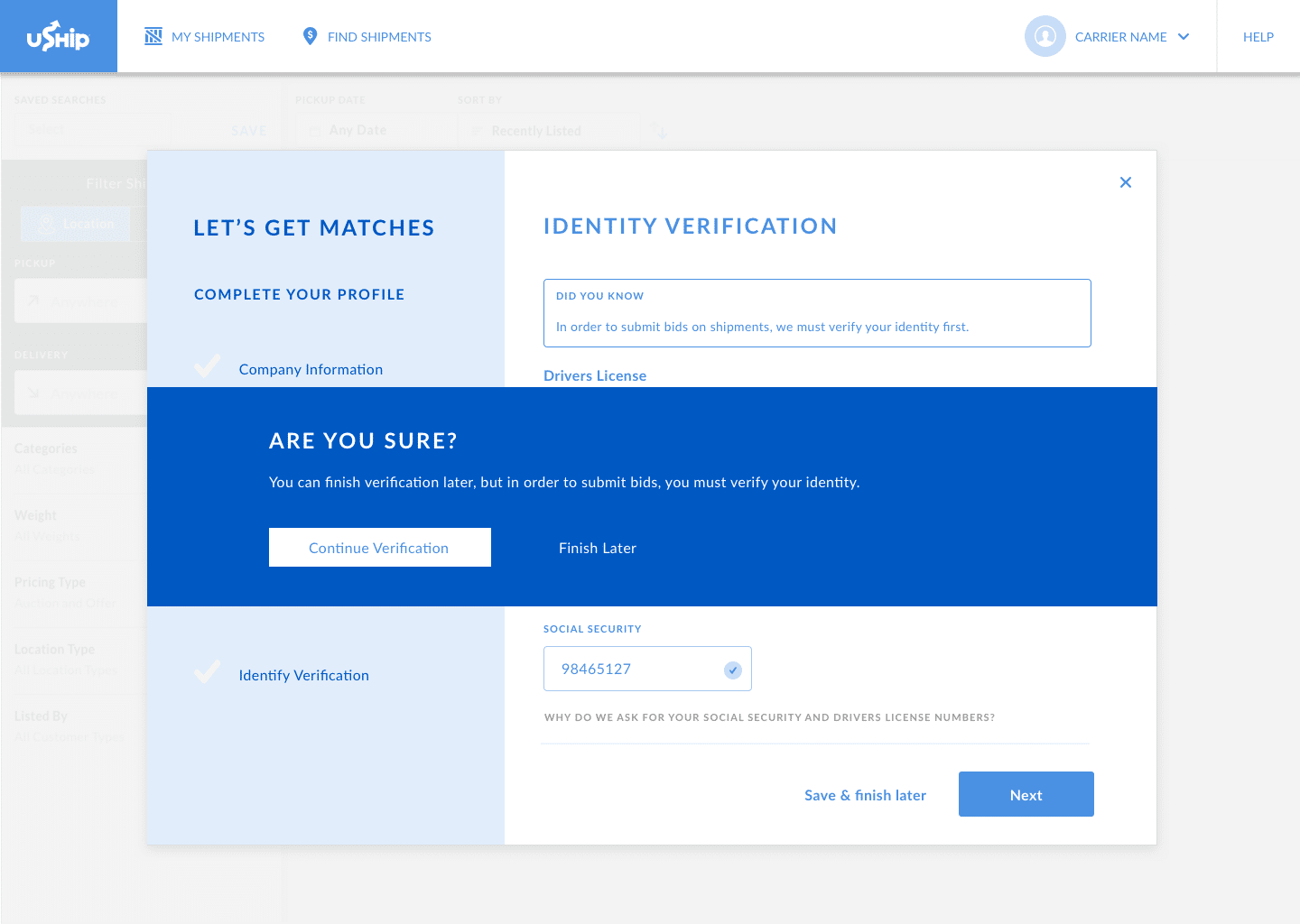
For identity verification, the user is warned about the importance of the step. Identity verification is required in order to place bids for shipments, so it is important the user understands this process.
At any point, a user can ‘Save and finish later.’
If the on-boarding is not complete, they would be prompted to on-board at later points of the experience, like when they are searching for shipments.
Alternate Registration Concept
The designs above assume a carrier registers by clicking “Register” in the header. However, 50% of our carriers will register through the “Find Shipments” section of our website. This is an interactive tool meant to show real shipments to encourage sign ups.
Here is what that screen looks like: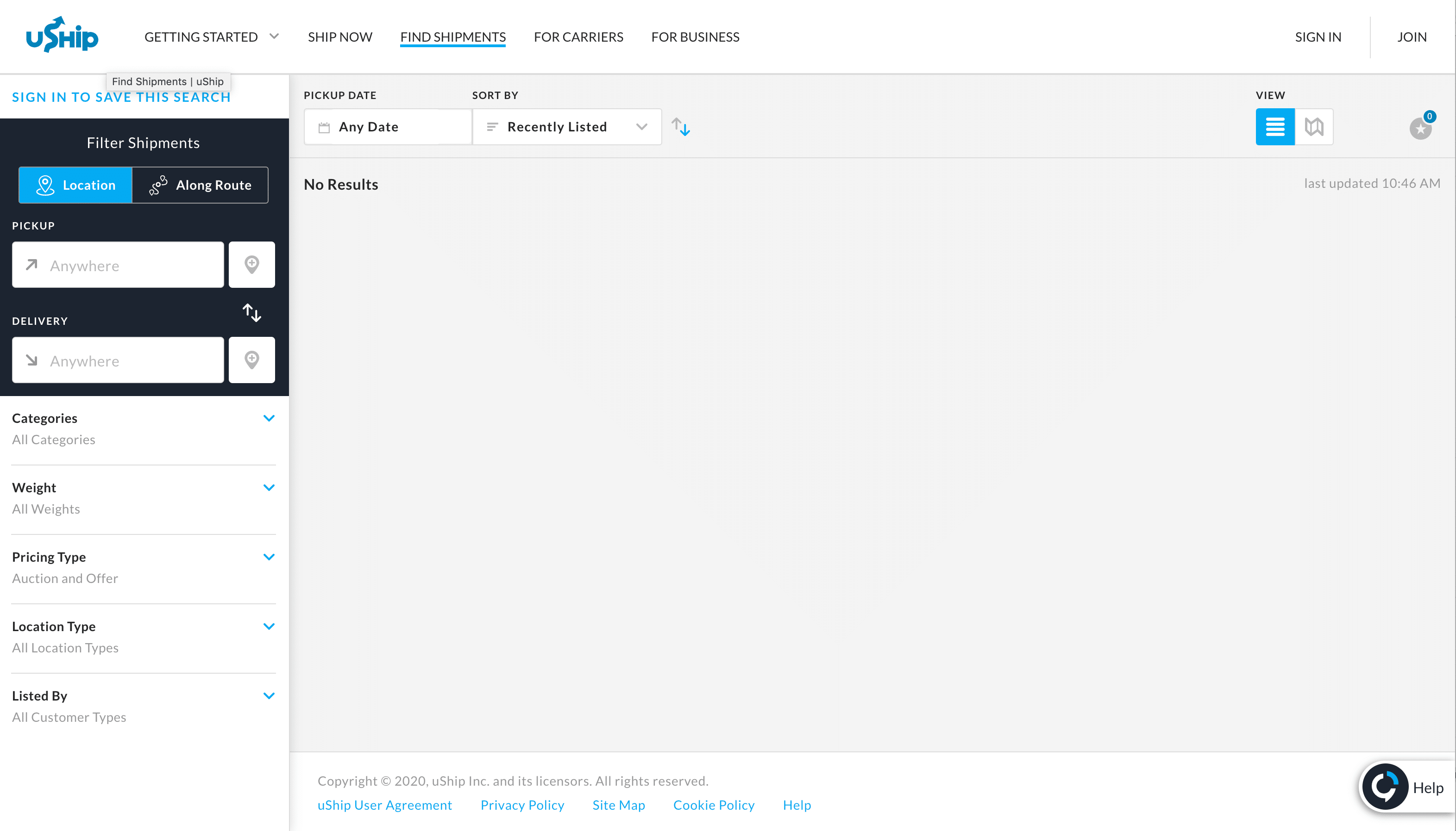
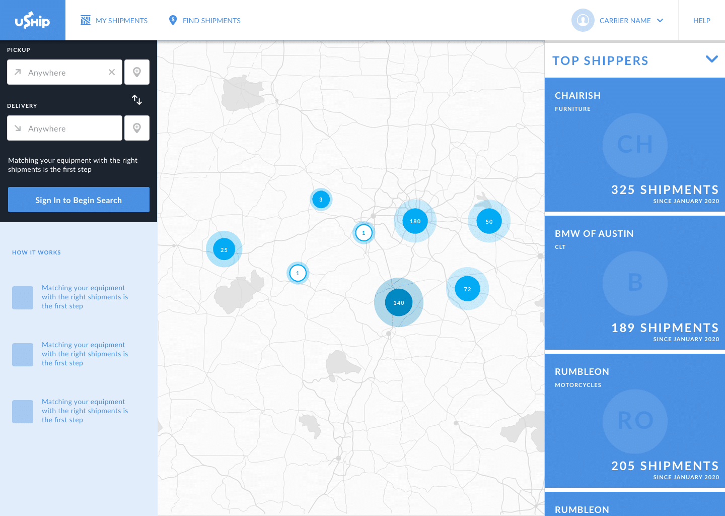
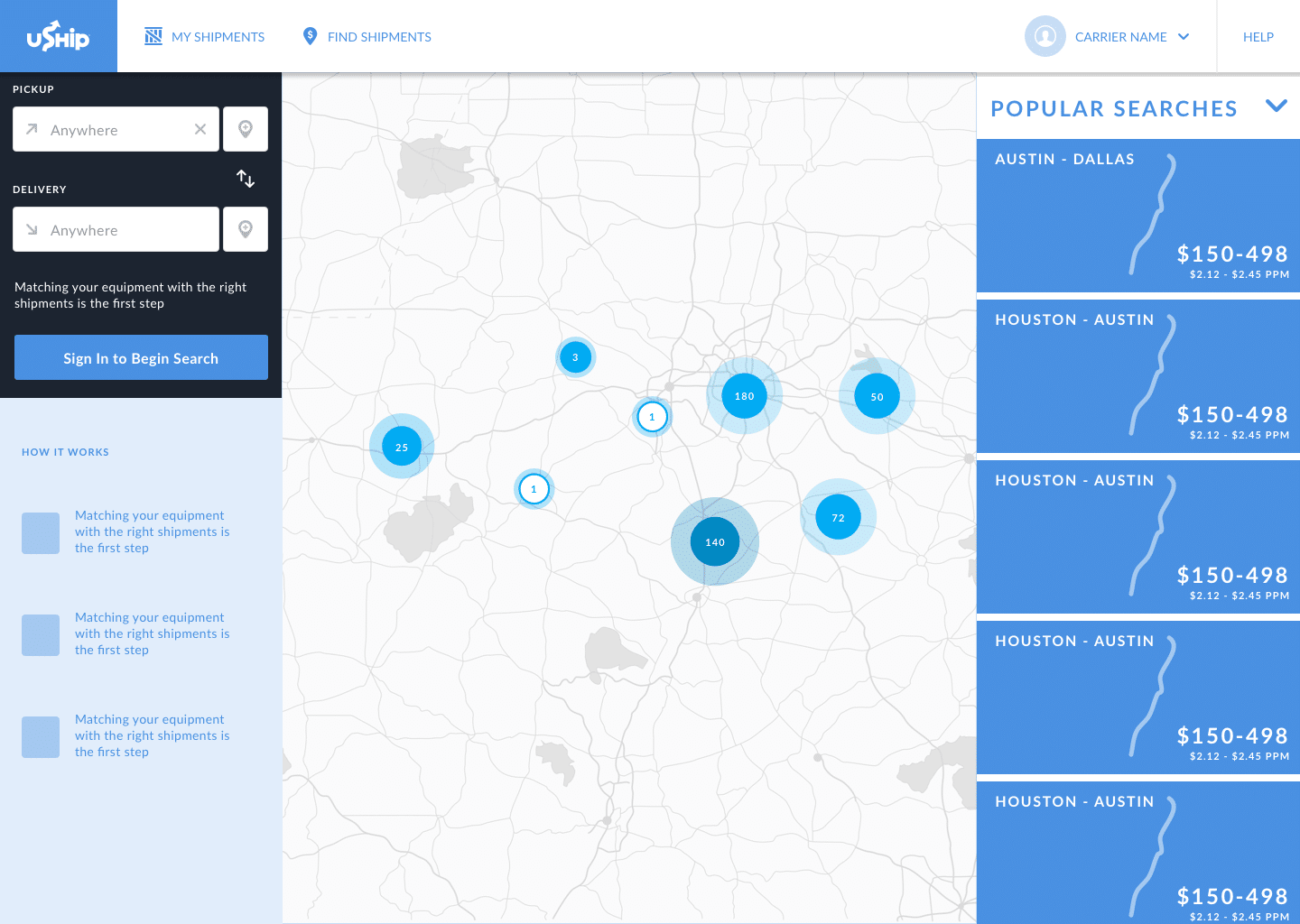
By default, this page is empty (unless location sharing is on). To further explore this page, I thought: “What if this page had marketing moments built in to encourage users to sign up?”
I mocked up a vision of this page with curated clients (shippers) or popular searches that for the carrier if they become a uShip carrier:
Conclusion
Due to roadmap shift and new technical considerations, our team changed focus to work on migrating existing users first. Migrating existing users meant I would work first on re-designing the account settings to work with our new identity provider.
Ideal Next Steps
My plan when returning to this section would be to start with user testing and user interviews to confirm the on-boarding topics. I would also begin collaborative discussions with engineering to learn about our technical limitations.

